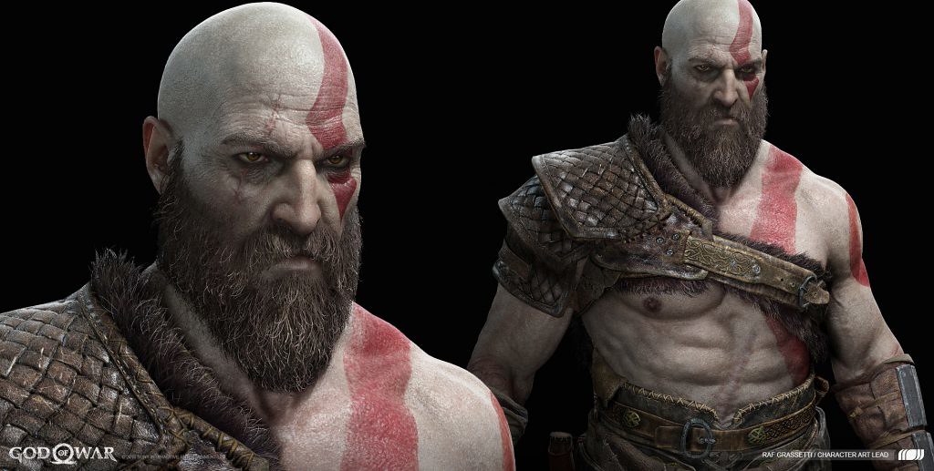
This week we have been celebrating the incredible artwork of God of War. Making games is truly a creative journey, from writing and design, to production and QA, and we at Santa Monica Studio are very excited to celebrate the art department and to share a glimpse of this process with all of you.
Our artists have posted hundreds of images that showcase the immense talent and imagination put into the project, so we hope you enjoy! With all that said, be aware: spoilers ahead! Or, as Kratos would say it, “BOY!”
Check out our incredible artwork in the links below:
Additionally, as part of this celebration, we’re kicking off our first official God of War Photo Mode contest starting TODAY. Submit your most creative and original God of War Photo Mode pics to us to enter to win a museum quality Cook & Becker print of your winning submission, signed by our team. PLUS you’ll also get a copy of Dark Horse’s in-depth and beautifully designed book, “The Art of God of War”‘.
To enter, just tweet your submission to @SonySantaMonica with #GOWPhotoModeContestEntry + #PS4Share. Make sure to submit soon. You’ll have until July 6th to enter to win! Go here to learn more.
Finally, below, we’d like to share with you three of our insightful behind-the-scenes story excerpts. They go in-depth into the art and animation of making this game, from the light and foliage in Alfheim to the fearsome, yet awe-inspiring Valkyries.
Interested in reading the full stories? We’d love for you to check them out here.
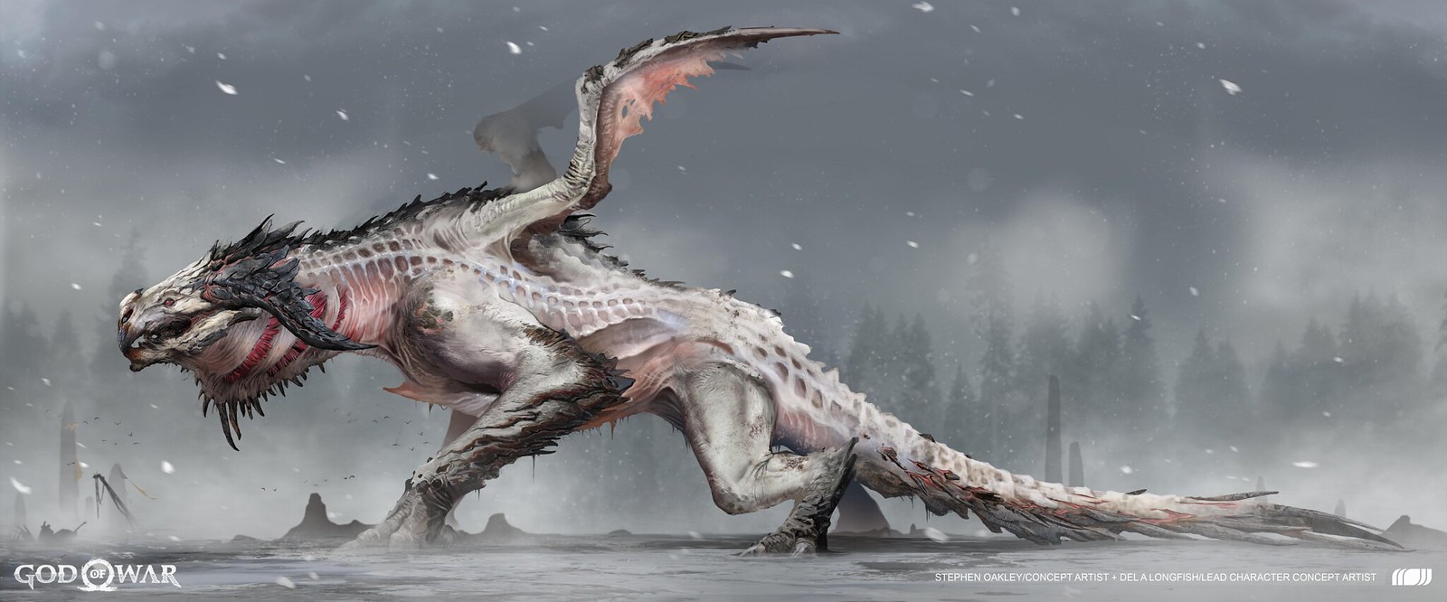
Deconstructing Hræzlyr – From jet turbines to Komodo dragons
Our Concept Artist, Stephen Oakley, pointed out one particular inspiration that took place with aquatic animals while creating early designs of Hræzlyr.
“I know that the earliest thoughts revolved around this mechanic of the dragon being like a jet turbine. Something that’s terrifying and that could be a fun gameplay mechanic (with the suction pulling enemies, and characters towards it).”
This gameplay mechanic led to artists José Cabrera, Vance Kovacs and Justin Sweet using different aquatic creatures to create a design.
“There was a piece that José had done early on that helped catapult the design forward. He had something that looked like a basking shark embedded into the belly of the dragon. I was looking at bass, which some fish had a surprising amount of suction for.
“This ended up inspiring a lot of features that are still inside of the Dragon today, like the gills, and it led to us trying to think of creative ways that were inspired from real life – to think about how they would be able to do the things that he does.”
On the animation front, the inspirations were focused on various creatures that create loud and powerful footsteps. Our Animator, Sophie Evans, recollected, “A lot of reference came from lizards, komodo dragons and tigers. These animals tend to be really heavy.”
The movements of the Mountain Dragon needed to be powerful and strong, she added.
“A lot of muscular animals like bears and tigers – they feel heavy because they have a lot of secondary motion from their muscles. With film and TV, you can get a lot of this type of movement, but in games usually, you don’t have the tech or support to have simulations on the muscles.
“So, I tried to imitate that secondary motion feeling with just the torso, so it’s really exaggerated – the up/down movement on the torso and even the exaggerated lateral left and right. This gives the dragon serpentine movements. So, a mix of reptilian back and forth mixed with really heavy up and down bounce is how I tried to approach this.”
Creating the Valkyries – Balancing fear and elegance
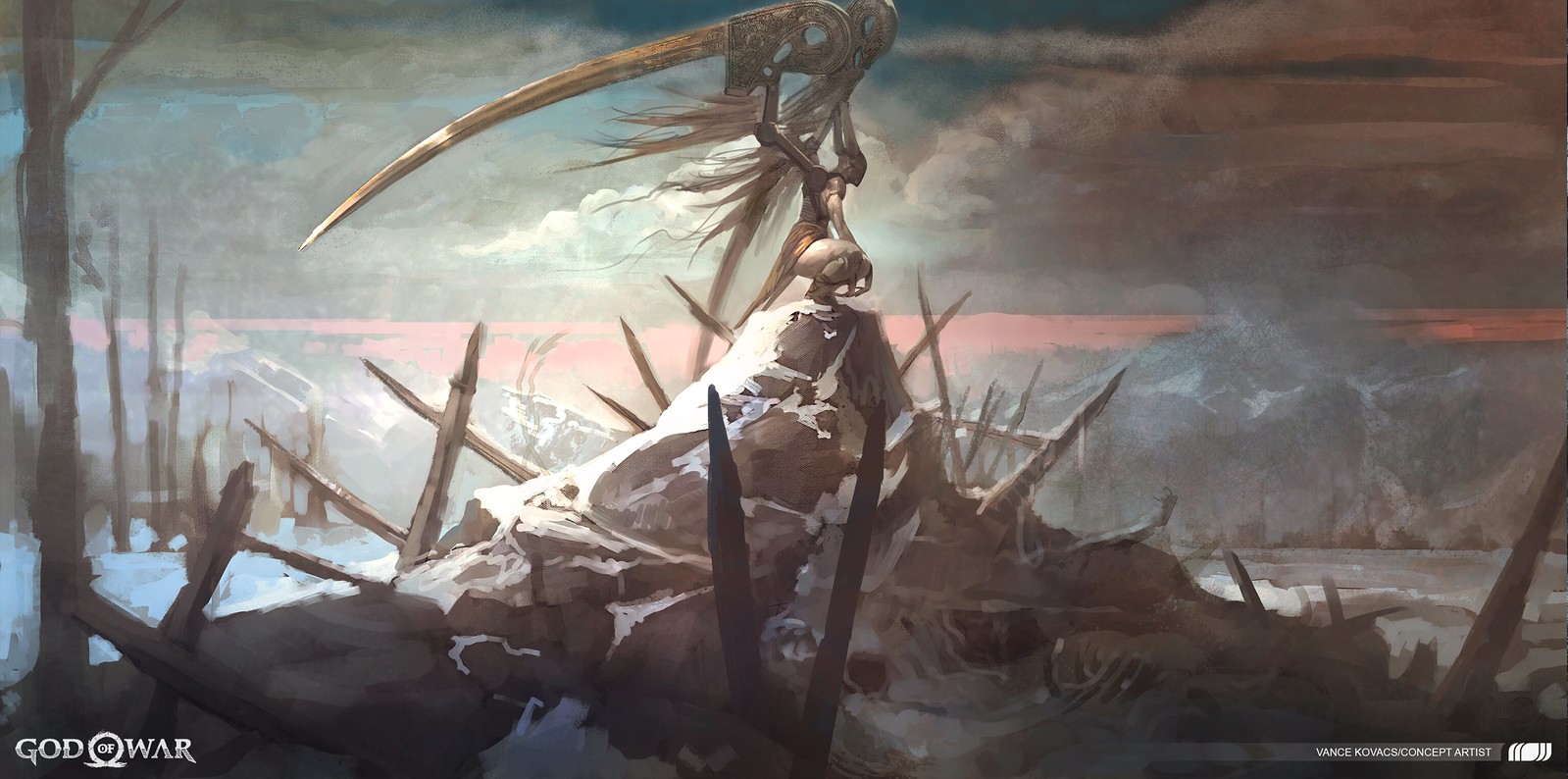
One of the most striking elements on the Valkyries came in the design of their wings. This became a very important element because of how the wings would be used in gameplay and it was also the first striking element that you would encounter when seeing a Valkyrie. Even the core design of these wings was very different from much of what you may have been used to seeing up to that point in the game.
Lead Character Concept Artist, Dela Longfish, remembered some of the challenges associated with this part of the design.
“Cory and much of the team really liked that the wings weren’t natural – creating an iconic look to these characters. But the wings were the most difficult part – getting these mechanical parts and making sure it didn’t feel out of place with the technology of the time. The design prompt was that we wanted these wings that were mechanical harnesses, but to make sure it fit with Vance Kovacs’ designs.
“Our art team would play around with how the Valkyries would use their hands to push and pull the wings, in order to attack and defend. At one point, there were even handles on the wings to really accentuate their mechanical nature.”
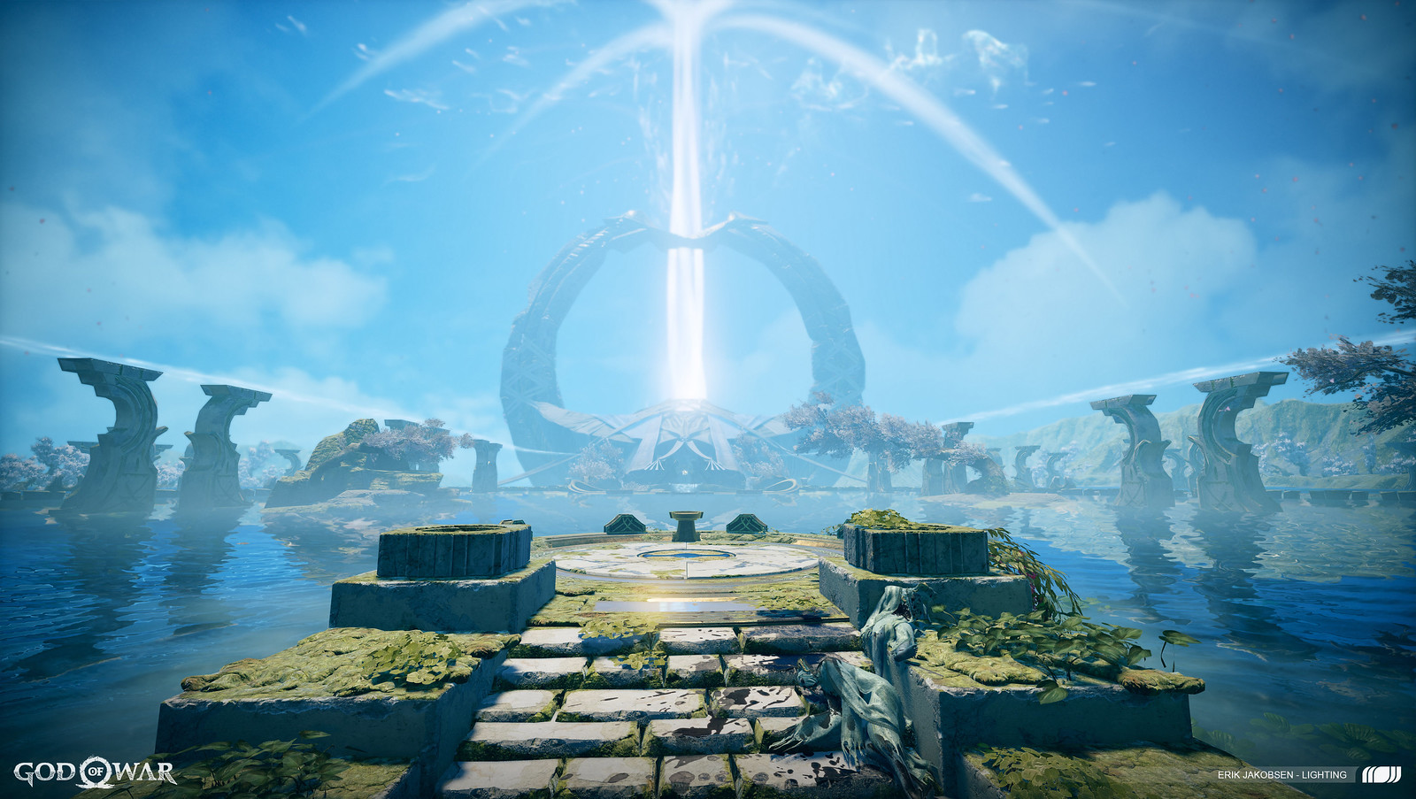
Constructing Alfheim – Designing the realm’s two clashing sides
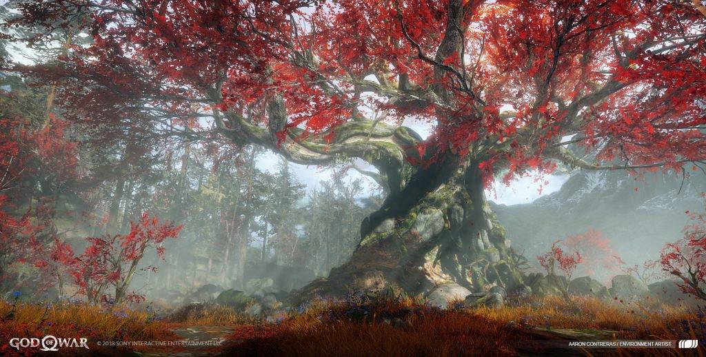
A fascinating artistic challenge that the Light of Alfheim affected was the foliage. All around Alfheim, as you venture through by both foot and boat, you experience varying tree shapes and otherworldly environment art. Much like everything in this area, even these trees are affected by the Light of Alfheim.
“Early on, the trees, the environment looked like as if it was growing towards a singular light source and that would look very different than Midgard or any other place,” Luke Berliner, Lead Environment Concept Artist explained.”
“I really liked the singular idea of that light source and how an entire ecology has grown around that in a unique way combined with a more fantastical architecture.”
This idea led to interesting concepts where the team played with the region’s fauna and how that would react to having a light source centralized as a beam.
Our Senior Environment Artist, Erik Jakobsen, then took those concepts and translated them into the 3D in-game environment, although the process wasn’t so simple due to the complex nature of trees chosen.
“These amazing trees, stretching towards the light, were definitely one of the first things I remember from Luke. This being the first realm you travel to made it difficult to strike a balance between real and magical. What looks good in a single beautiful concept sometimes needs to be tested out in 3D to get the balance correct. Leaves that are too red or too white may throw off the other level elements.”
Thank you again so much to all of our fans worldwide. We’re humbled and honored to share all of our artwork with you! Follow us @SonySantaMonica on Twitter or @SantaMonicaStudio on Instagram to stay in touch for all things God of War.
The post Celebrating the incredible art of God of War appeared first on PlayStation.Blog.Europe.
from PlayStation.Blog.Europe https://ift.tt/2K0JWOu
via


0 commentaires:
Enregistrer un commentaire