Hello VR friends! Let’s talk visuals today! We sat down with Sebastian Brueckner and Jamie Alexander Smith, Art Director and Animation Lead on Astro Bot Rescue Mission, respectively, to give you a bit of insight on how the game’s visual style came to life.
Testing and building the environment
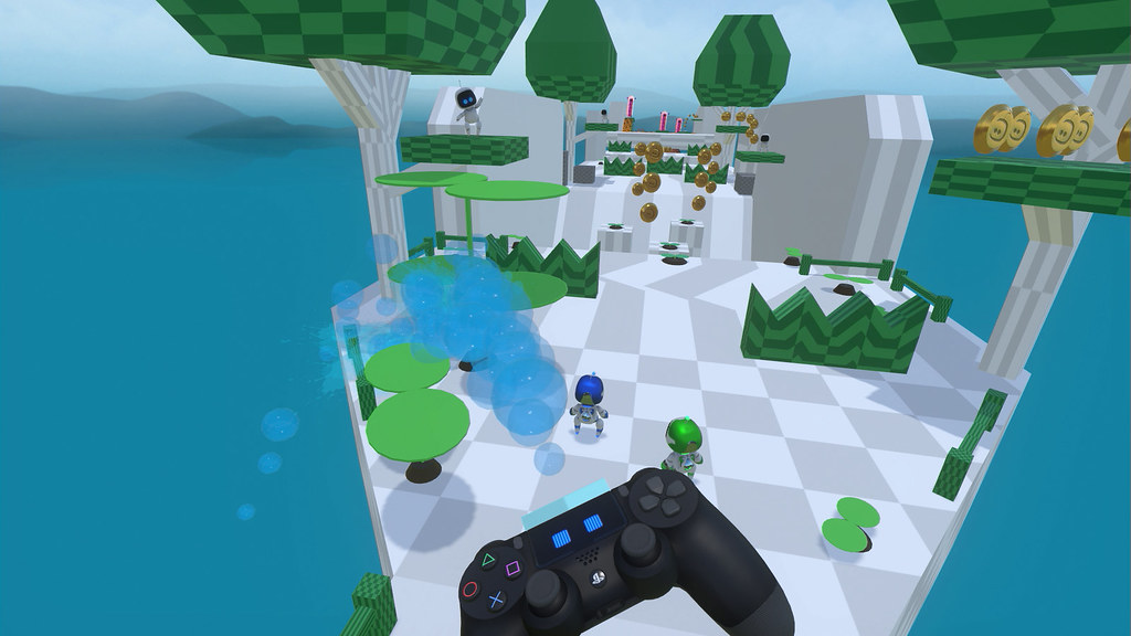
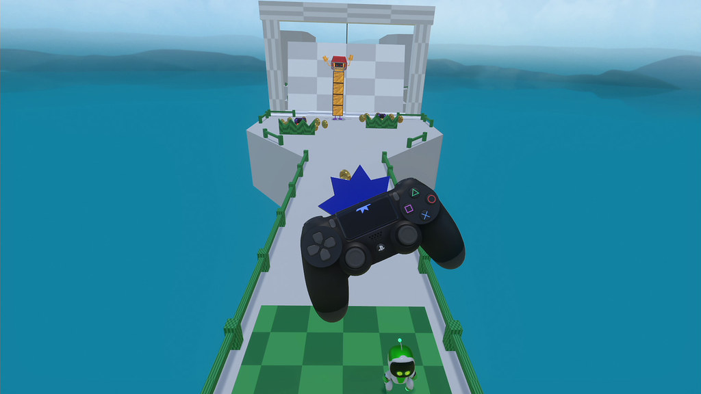
Starting with environments, the stages were first created by game designers in a very rough format, using plain blocks to establish gameplay. Once we had a solid, fun base, the art team would remake the platforms from scratch at high quality and made them reuseable at different angles (like toy blocks that could connect in various ways).
This technique gave us flexibility for building levels and allowed us to reduce the burden on the system.
At times, the gameplay prototype created by the designers had to be changed quite drastically. For example, the Dragon boss prototype became a Gorilla to be more in line with the pop culture thematic we were shooting for and fit the urban style of the level.
Giving the world a reactive, digital identity
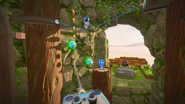
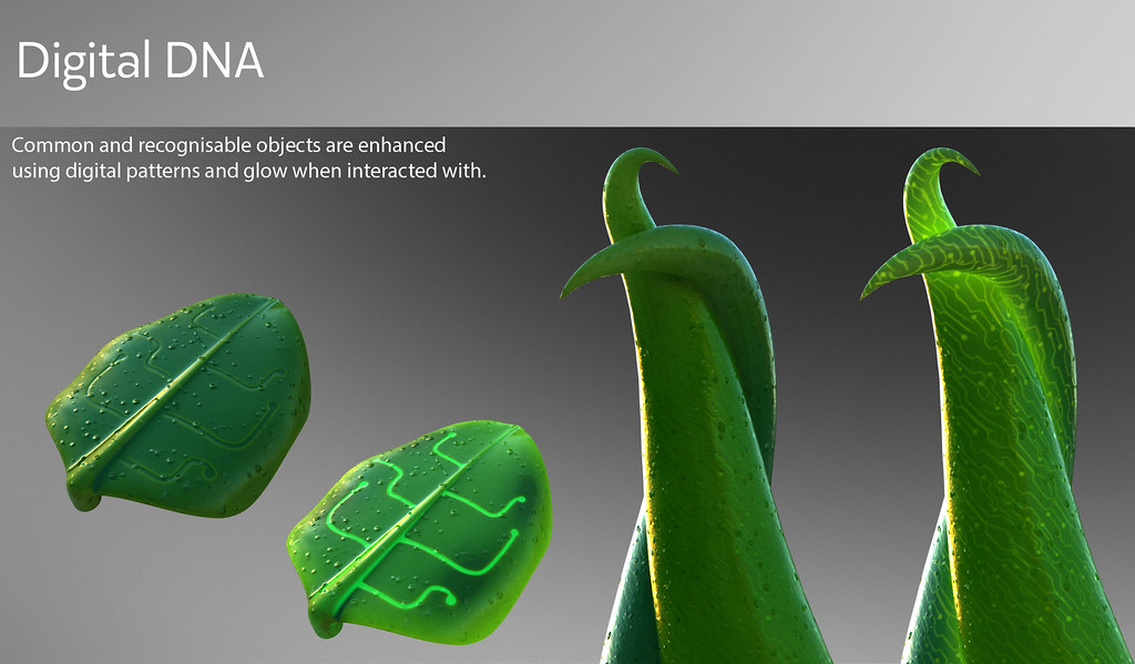
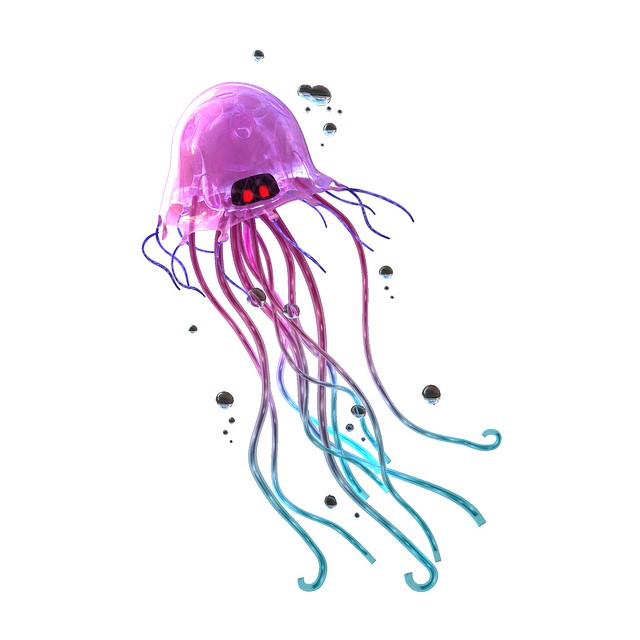
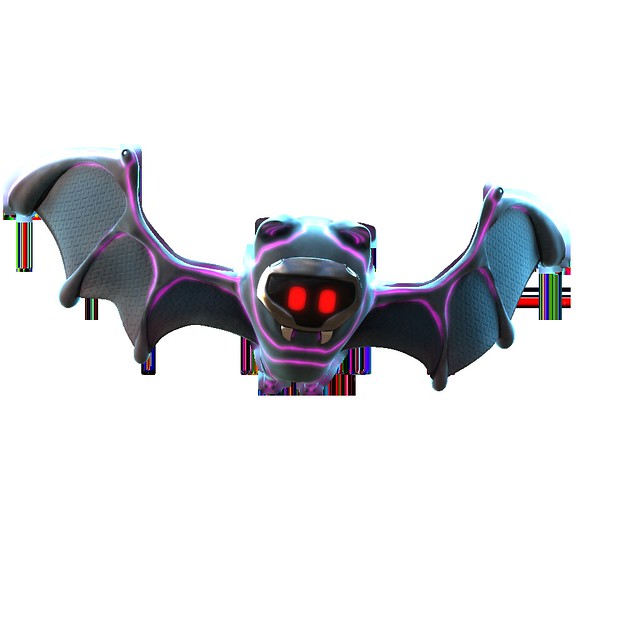
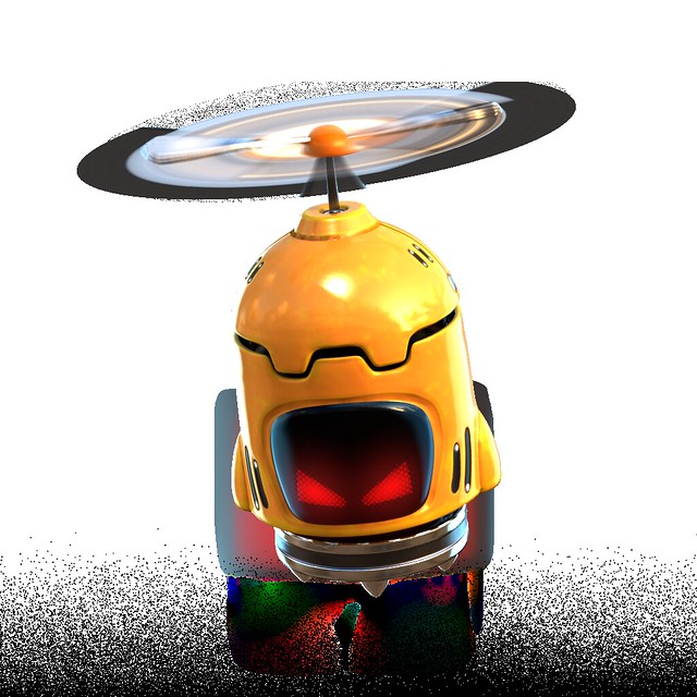
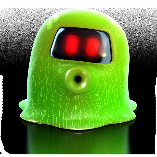
To dress up each level, the choice of materials was particularly critical for the Art Director, Sebastian. He and the team tried various styles to find the best match for VR. Through continuous research characters, enemies, vegetation (right down to the rocks) created a super-tangible feeling. We injected each object with a digital DNA, such as printed circuits board patterns and LED faceplates. This gave the game a unique playful, digital identity.
Perfecting character animation
Another big area is character animation as we sought to bring a believable world to life. The game features a big cast of fun characters, friends and foes to support the gameplay and make the game a fun, interactive diorama.
Nearly every object in the game reacts to touching or punching it, which cements the player’s presence in the world, while turning it into an interactive sandbox.
Prototyping became crucial for Jamie and the animation team. For example, they found out exaggerated animations, similar to classic cartoons, did not bode well in VR. Timings had to be adjusted for animations to translate well and this took some iterations.
They played a lot on the duality of characters. For the bots, they balanced the cuteness with mischievous undertones: The Bots end of level celebrations are a good example of this sweet, yet edgy style.
For bosses, they followed a similar approach. The battle would start with a scary, intimidating arrival, then, as the player hits back, the bosses’ weakness would start appearing, making them look vulnerable and a little bit silly. This contrast not only empowered the player in their effort but also served as a ramp towards a humorous outcome.
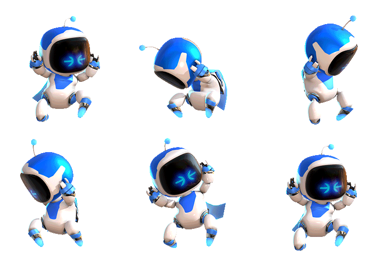
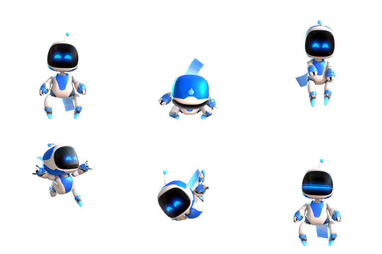
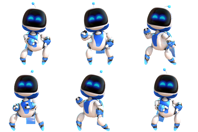
We hope this gave you a little bit of insight on how we created Astro Bot Rescue Mission. To thank you for your astronomical support over the past weeks, we would like to give a little gift: Here are some animated clips from the game. So get your dancing boots and get sharing! Let us know which one is your favourite.
The post How Japan Studio defined the visual style of its PS VR hit Astro Bot Rescue Mission appeared first on PlayStation.Blog.Europe.
from PlayStation.Blog.Europe https://play.st/2FLWeaQ
via



0 commentaires:
Enregistrer un commentaire